Best of SS18
Spring is now just days way, and with London Fashion Week Men's kicking off shortly, it seemed apt to revisit the best of last season's shows and take a look back (or should that be forward?) to the major trends for spring 2018.
Looking back, the shows and presentations that we saw could be split between the avant-garde and fashion forward to the wearable and suitable for all seasons. There was a definite increase in brands concentrating on garments for all year round, less of a focus on spring as a season with layering and light fabrics accounting for warmer climes.
Here's a look at some of our favourite shows and the most prevalent trends of the season.
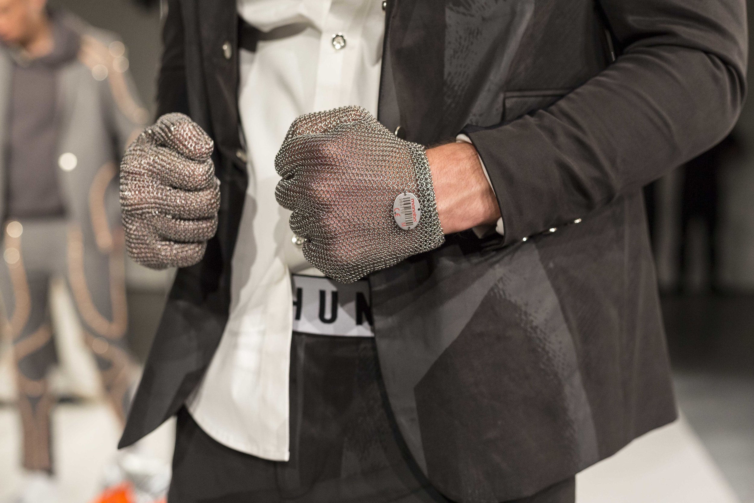
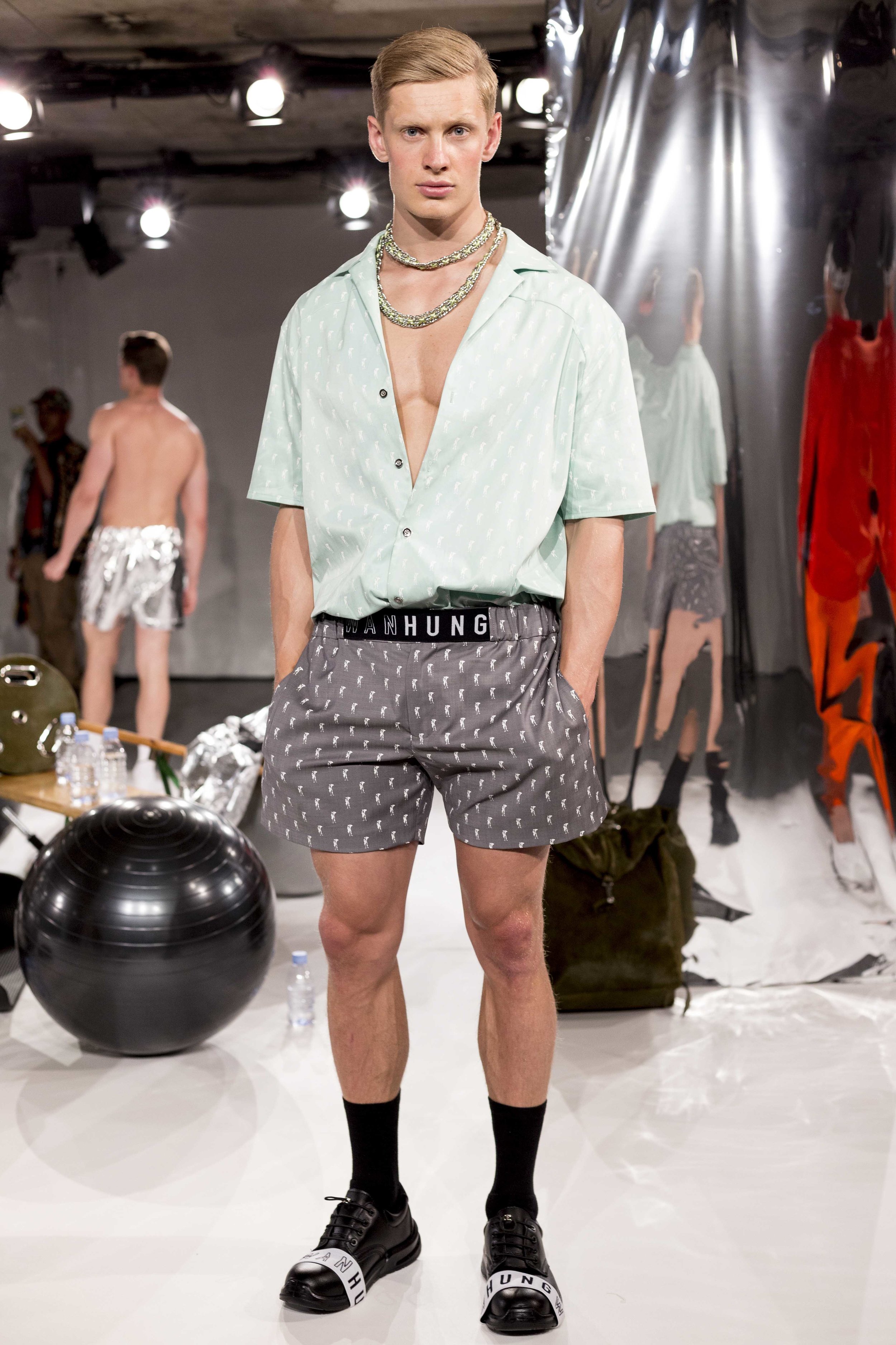
A wonderful fusion of sportswear and formalwear, Wan Hung presented a collection that evoked thoughts of Miami, beaches and muscles. Designed with the man that gyms and works in a suit in mind, the designs included thoughtful details like air vents in tailored jackets and sporty mesh lining. The special briefs will also make you the envy of the locker room.
ASTRID ANDERSEN
For a designer that has dominated the luxury sportswear market for some time now, the challenge is in how to translate the familiar into something that is new and unexpected but still fresh, relevant and familiar. For spring, Andersen reinterpreted the age old safari trend, which has been referenced so many times and sought to present it in a new light; one that is in keeping with her brand’s aesthetics. The colour palette and choice of fabric are always a strong focus in an Astrid Andersen collection and the spring offering was no different. A hybrid of muted green, metallic lace and loose natural cottons were mixed with seam sealed finishes on fine woven and printed floral silk. The latter was an absolute standout of the show and a masterful demonstration of how the designer can seamlessly navigate between two worlds. It was the perfect showcase for a brand that delivers an unexpected edge to contemporary menswear whilst maintaining high standards of luxury and tradition.
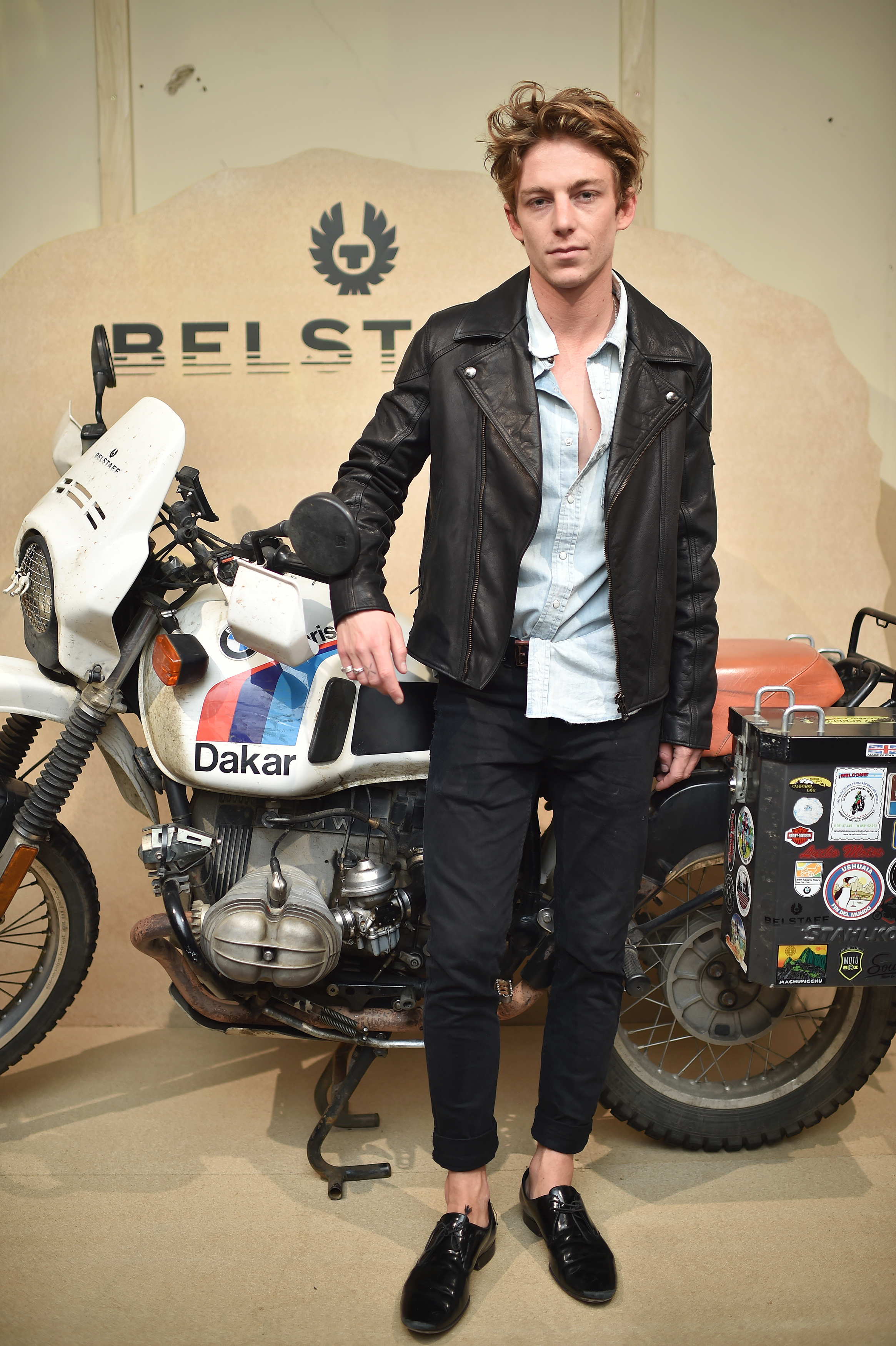
Burnt and blackened sandy leather biker jackets are worn with bold black t-shirts, emblazoned with the Belstaff logo, and paired with sandstone trousers, rolled up at the ankle to reveal heavy, black leather boots. A pale rose cagoule, with half-sleeves and cut just below the belt, is paired similarly, and the heat of North Africa weaves its way into the collection in the form of a thick scorched-orange sweater, branded with simplicity. More of this orange hue is threaded finely into a knee-length checked mac, monochrome save for these fire-like highlights. The coat comes coupled with a bright buttercup-yellow tee, worn with slim-fitting trousers in porcelain.
BEN SHERMAN
The spring collection from Ben Sherman was aptly named “Peacock Revolution”, harking back to the 1960s when Mick Jagger types were not afraid of donning a bold and distinctive dress sense. This mood allowed the label to expect from their on brand heritage suits and shirts and into new territory; that being a new version of jeans, in rakish tan and camel hues. Much bolder and more exciting than navy and indigo. A highlight of the made in London offering was the large cuffed, tapered version that were high waisted and constructed from selvage denim. They stood about from the more tailored pieces which dominated the rest of the clothing that appeared on the catwalk.
BERTHOLD
A study of masculinity and conflict. As a point of reference the designer considered images of child soldiers across Sierra Leone, Uganda, Nigeria and Liberia. The images all revealed an almost absurd brutality. The clothes were all too big, the child shoulders all looked like they were playing dress up with guns slung across their shoulders. The resounding sense was clothes that were so oversized that they dwarfed their tiny frames and exaggerated their sense of manliness and pride. The very notion of child soldiers is awkward, and the Berthold collection highlighted these contrasts. Enlarged sleeves are designed to be worn rolled-up are left unfurled; exaggerated funnel necks are worn with cropped tunics. Wrap front trousers are left loosened.
The white collar worker got a swag update at A Cold Wall SS18 where models carried photocopy paper shopping baskets, and strutted down the catwalk in oversized, windowpane checks, PVC boiler suits and asymmetric navy suit jackets.
Recent seasons have seen an evolution of E. Tautz introducing “easy tailoring” as a new menswear concept. For spring this was taken further with the introduction of the superb loose pyjama style striped suits. Whilst the thought would invoke the idea of grandad chic, this was most definitely not the case. In fact, the collection was younger and fresher than the last few seasons. Patrick Grant is the master of a nonchalant, Savile-Row inspired yet modern approach to dressing and this collection had all of these elements. The 150th anniversary of the brand was treated as a greatest hits, as opposed to the chance to offer something new. Pinstripe suits, oversized tortoise shell spectacles designed in collaboration with Kirk Originals and summer shoes from Christian Louboutin are all trademarks of the brand, and of course, are part and parcel of the reason that the brand has achieved the success that it has. That success comes down to that superb blend of polished yet relaxed that is captured in each and every look of the collection.
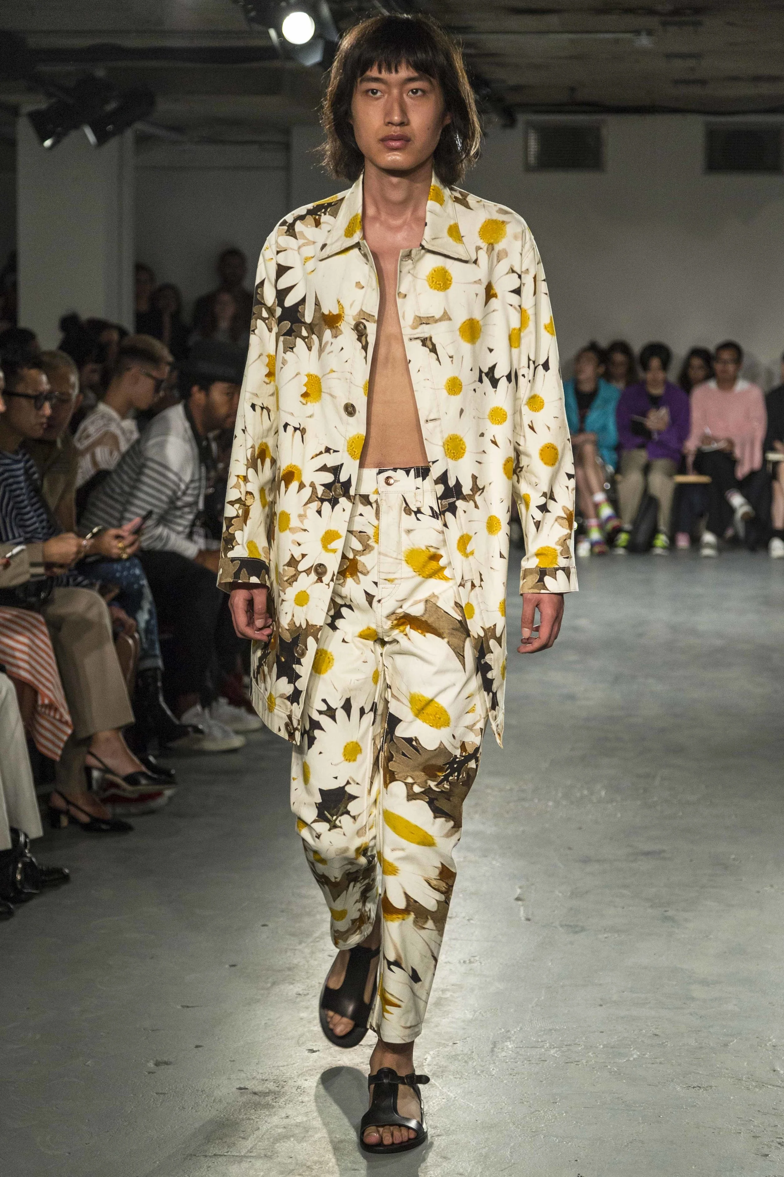
Presenting a bolder vision for spring than seen elsewhere at fashion week, the designer incorporated sheer materials with floral work onto a PVC construction. A number of pieces were transparent and deconstructed, highlighting the take on modern masculinity as a romanticised one. The general effect of classic embroidery combined with shiny, futuristic metallics was rather breathtaking. The clothes were edgy but wearable, flatteringly cut, smart and quirky. Where proportions were exaggerated, for example on the sleeves of a jacket or the collars of a coat, the effect was playful and intriguing.
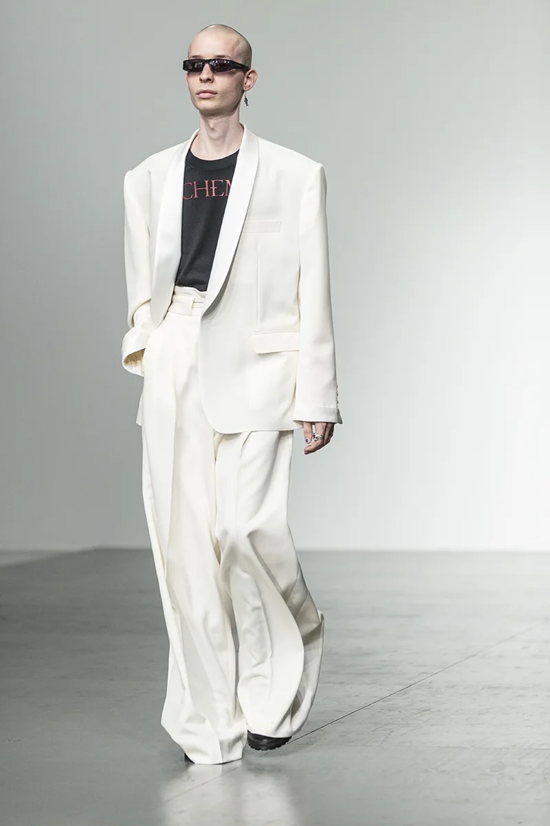
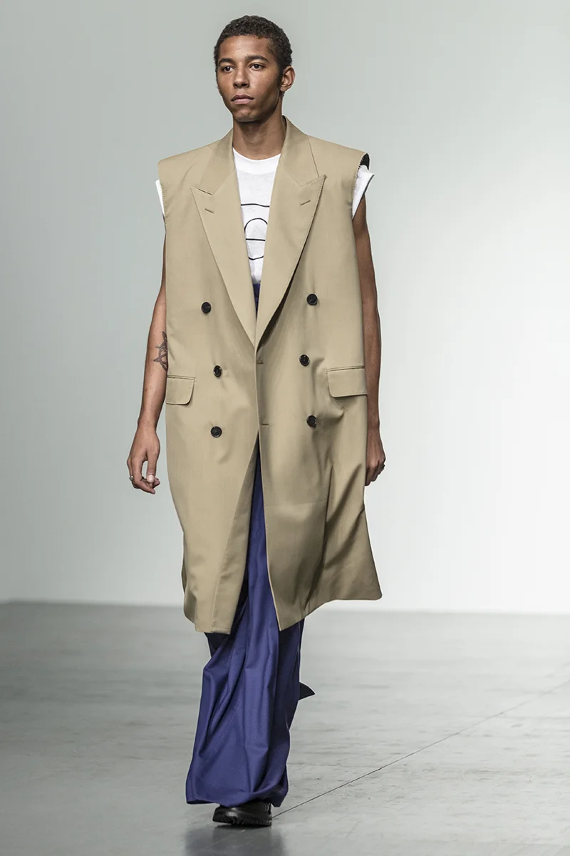
All of the basic tailoring pieces were clear and present, with a firm focus on the era that style forgot. It was the Sullivan twist that made the pieces memorable and desirable. Double breasted suits had sleeves stripped whilst trousers had legs so wide and long that it was hard to imagine that the skinny models had legs at all under them. Nevertheless the proportions made for an incredible statement, more editorial than office appropriate. The shades were all the ones that we will be digging next season - blush pink and bright white which would look superb whilst leaning up against a bar.
OLIVER SPENCER
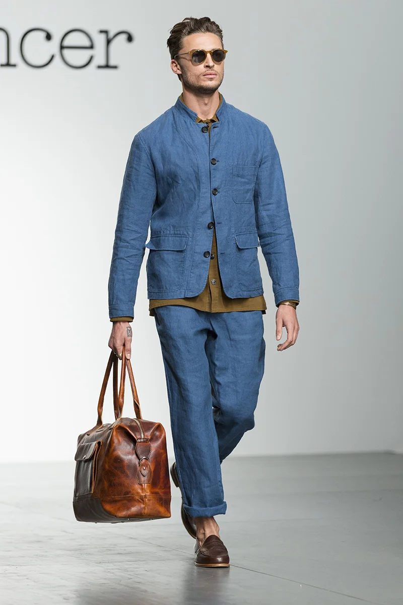
As the weather is almost always unpredictable in London, the collection featured raincoats, parkas, shorts and sunglasses. Fabrics were loose and channeling a chic French Riviera vibe - soft suede, linen and that classic summer fabric of chambray. The lightness extended from the fabric and colour to the fit, with lightweight bomber jackets, collarless blazers and relaxed tailoring in tan, navy and dusty pink all making an appearance on the catwalk. It was almost as if the designer was desperately hoping for the grey skies to disappear and for the sun to creep up, as models sported tops with sleeves rolled up. Those jackets would certainly look good stepping off a flight in sunnier climes. That sense of optimism extended to cropped shorts, loose fitting trousers and shoes worn sans-socks. It would not be inappropriate to say that nothing here broke any new ground. It did however, showcase the power of great fit and colour, snazzy styling and why we should sometimes step outside of our comfort zone to embrace a colour, print or check that we would normally opt for.
Cast your minds back to AW17. Crutchley’s presentation was full of opulent silks, dandified prints and an abundance of pomp and circumstance. For spring 2018, Edward Crutchlety continued to explore historical references, whilst throwing in modern sportswear and a rakish 1940s silhouette. Those historical references (just like last season) were wide ranging and extended to Italian Renaissance patterns, 15th century regal silk gowns, bustiers, high waisted blouses and victorian collars. The effect was rather outstanding. The show opened with an achingly cool camel suit, exaggerated in its proportions and styled with a black. basque and low top sneakers. The decision to show proportions that are frankly unlikely to be sported by any of us anytime soon, somehow concentrated the shape - letting the viewer really see the effect of wearing super baggy or high waisted trousers.
BOBBY ABLEY
Entitled “Messy Fun” the collection was unashamed in its appreciation of youth culture with the show notes declaring that the collection “sought to explore the exuberance of youth”. The effect of that exploration was an incredibly in-your-face collection with bright, loud colours and statements being made on the clothes, slogan and hair & make-up. The designer made the characters from the show come to life with an intelligent and witty take on the colours and themes. The traditional cropped hoodies, tracksuits and layered dresses were presented in the iconic red, green, yellow and purple and there was even a twist on Tinky-Winky’s red handbag. The alternative was the trademark teddybear backpack which we have marked out as an early sell-out piece.
Silhouettes were clean and street inspired, which worked perfectly well for the insane prints. Print has always been a key feature of a Katie Eary collection and the spring versions were some of the best that we have seen from the brand, with emerald green dragonflies, neon green butterflies and cobalt blue on black hoodies, shorts and pants. Delicate materials made these colours sparkle even more, and the light fabrics were strengthened with heavy trims and neoprene. The styling was also spot on - slouchy, layered fabrics and textures, clashing colours with tracksuit tops worn with matching bottoms, held up by utilitarian belts, slung low to show off silky boxer shorts.
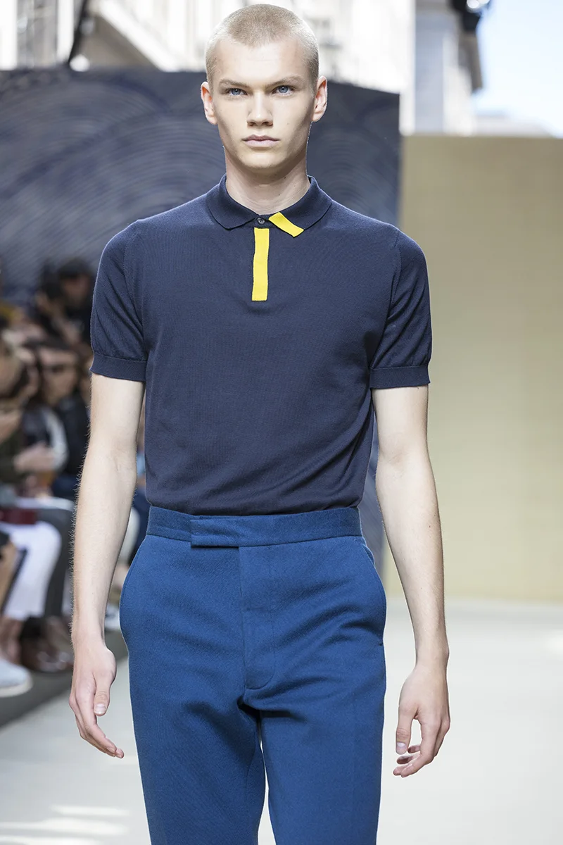
Inspired by an original watercolour of Japanese Koi that was purchased by Mr. John Smedley in the Thirties, the collection was a study of precision and fluidity. The watercolour emblem appeared all over the dual sex collection, boldly on sharp suits and more discreetly on the panels of polo shirts. It was especially impressive in knitted yellow, with Japanese style waves proving to be a brilliant focus that balanced a simple motif and an innovative artistic notion.
KENT AND CURWEN
The collection was inspired by 'teams', presented by live models who collected on a rostrum in front of adoring guests, reminiscent of a sporting team photograph. This is a collection of bold and re-thought sportswear that blurs the boundary between old and new, worn with a British nonchalance. Creative Director Daniel Kearns and Mr Beckham took particular interest in how gentlemen would mix items of team clothing to make a sartorial statement and express individuality when looking at images from past decades of Oxford and Cambridge sporting teams. It's evident in the collection that they have taken subtle inspiration from the classic sporting chic of these home institutions. For Kent & Curwen’s Spring-Summer 2018 collection traditional British summer dress codes are adopted and then intelligently broken to purposefully undermine expectations and lend an anti-establishment edge to a gentleman's wardrobe.
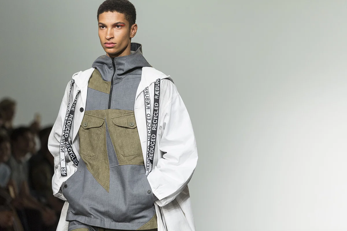
The show opened with a host of outerwear, including but not limited to capes, macs and parkas with shorts that were made from bright red-orange mesh and jersey. In keeping with the escape and travel inspiration, desert camo print featured heavily on a number of pieces, which were cleverly reworked into bombers, shirts and shorts. The reworking and the transforming of vintage army surplus has become a Raeburn aesthetic and one that the designer is quite rightly proud of - Remade, Reduced, Recycled was etched on the trim of a number of the pieces and tote bags
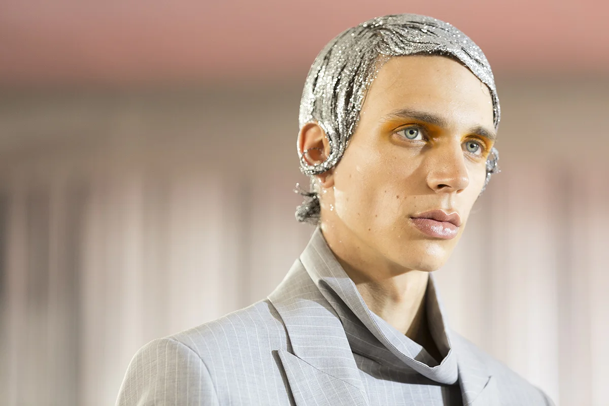
The theme for spring 2018 was New Romantics. Tailoring has always been a strong suit for the label and these suits are made for bright, young things that want to rave all night. Glitter hair, club culture and voluminous shapes all cane together to throwback to a time when London was the fashion and cultural capital of the world. The 80s were not only new designers like Vivienne Westwood, they were also the decade that brought us the fashion magazine and that cut out and stick on your wall culture that has been digitally replaced with Instagram. These clothes are for kids that want to be seen and heard and that are unafraid to explore the power of shape.
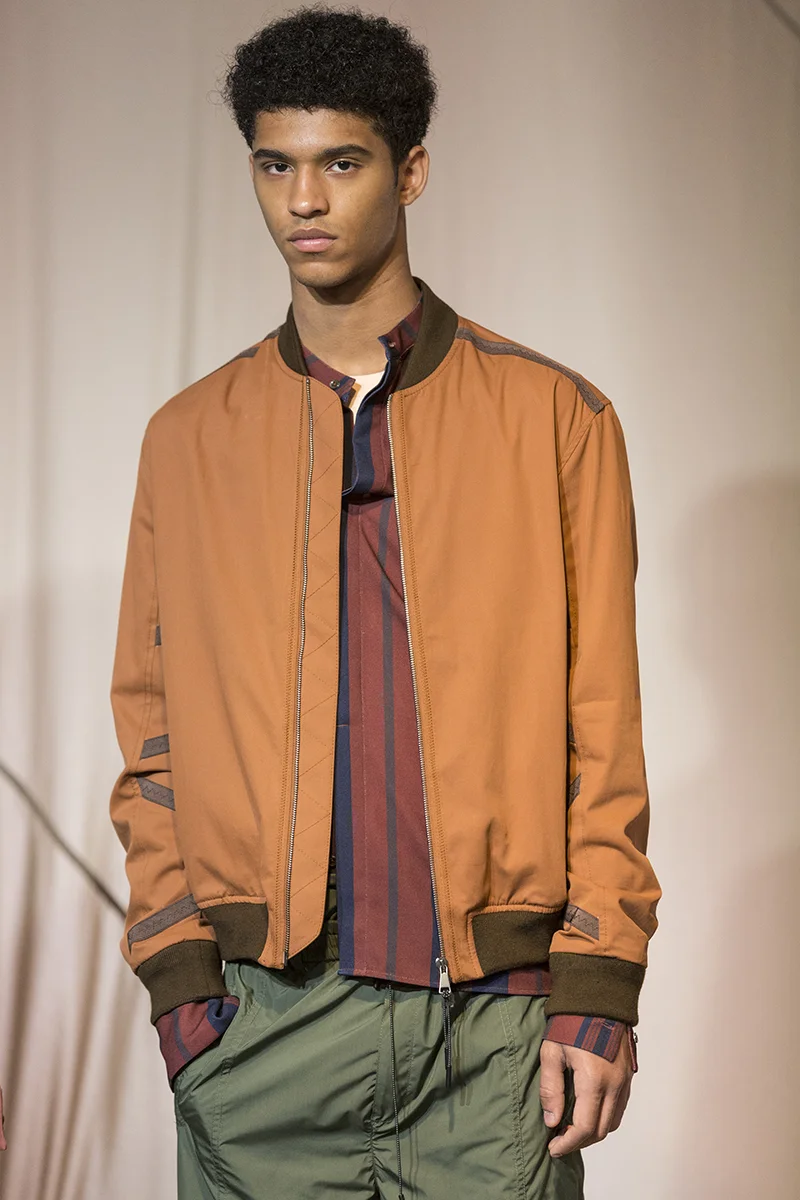
Colours and textures were perfect for transitioning from summer to autumn. Light waffle knits were utilised under silk nylon and outerwear was made from coated canvas for durability. Inspired by the nomadic tribes of the Middle East (watch Lawrence of Arabia if you don’t know) the colours were lush and sumptuous. We were especially fond of the khaki and sunburnt sienna shades and the bursts of pink and red that was interspersed in pinstripes and on shirting. Keeping things similarly simple, accessories were modern and cool, with duffle bags slung over backs and the summer sandal making a comeback.
Shape and colour were the foundation stones on which the collection was built. The offering looked back to 1957, and specifically to the Whitney Museum of Modern Art where Ellsworth Kelly presented three contributions to the cutting edge Young America exhibition. The Atlantic, Bar & Painting in Three Panels broke new ground and let the way for the avant-garde and colourful. That inspiration presented itself in the easy wearability of this collection which evoked a sense of the Long Island professional at play with his surfboard.
There is no doubt that it is the incredibly lush colours that are the real stars of the spring range. In a sea of black, white and navy and an emphasis on trans seasonal menswear elsewhere, this was an unashamed collection tailor made for the summer gent. Pistachio, rose, dusty pink, coffee was beautifully interspersed with aqua and fuchsia, for a soothing and look at me (in the rakish sense) quality.
ALEX MULLINS
Everything was slightly lopsided at Alex Mullins, which has become a familiar silhouette for the designer. The arms of shirts and jackets were subverted and graphic., whilst waistbands creeped up the torso presenting a distinct impression of dislocation.
Blood Brother explored serious issues - global warming and climate change through a series of prints on bomber jackets, superb silk shirts and plain T-shirts. Fabrics were luxe, with precise details and a vibrant palette of colours.
The brand gets stronger each season and for spring, the introduction of more tailored pieces and impeccable outerwear styled with simple Tees and sneakers made for a collection where each look was easily wearable.
NICHOLAS DALEY
New to the fashion week schedule, Nicholas Daley presented a memorable first collection, considering the notions of of multiculturalism and diversity. Tartan was a nod to the designers Scottish routes, whilst madras was an ode to the relationship between South Asia and Britain and the trade of textiles between the two. The fabrics looked rare, refined and like family heirlooms that were well constructed and fluid.
All images by Nicholas Andrews


